react-native-cli-hold-menu
React Native Cli Hold Menu

A performant, easy-to-use hold to open a context menu for React Native Cli 🔥
Features
- Smooth interactions & animations.
- Supports dark/light Mode. 🌚 🌝
- Supports device orientation change.
- Compatible with Cli.
- Written in
TypeScript.
Getting Started
- id: getting-started
- title: Getting Started
- Description: A performant, easy-to-use hold to open the context menu for React Native Cli 🔥
- hide_title: true
- slug: /
- hide_table_of_contents: true
Installation
yarn add react-native-cli-hold-menu
Dependencies
This library needs these dependencies to be installed in your project before you can use it:
yarn add react-native-reanimated react-native-gesture-handler react-native-unimodules @react-native-community/blur react-native-haptic-feedback
React Native Gesture Handler needs extra steps to finalize its installation, please follow their installation instructions.
React Native Reanimated needs extra steps to finalize its installation, please follow their installation instructions.
id: props title: Props slug: /props —
HoldMenuProvider
iconComponent
If you want to use an icon in your menu items, you need to set your Icon component to HoldMenuProvider to be able to use it. Then you can put just the icon’s name in the menu item list with the icon prop like below.
:::note Icon can be used with just react-native-vector-icons for now. :::
import FeatherIcon from 'react-native-vector-icons/Feather';

/* ... */
<HoldMenuProvider iconComponent={FeatherIcon}>
theme
If you want to set a specific theme or change depends on your theme, use the theme prop like below.
Values:
| value | default |
|---|---|
| light | true |
| dark | false |
<HoldMenuProvider theme={"dark"}>
safeAreaInsets
Set object of safe area inset values to prevent the menu from being opened under the unsafe area
Example
const safeAreaInsets = useSafeAreaProvider();
<HoldMenuProvider safeAreaInsets={safeAreaInsets} />;
onOpen
Fires callback when a menu is opened
Example
const onOpen = useCallback(() => {
  console.log('App onOpen')
}, []);

<HoldMenuProvider onOpen={onOpen} />;
onClose
Fires callback when a menu is opened
Example
const onClose = useCallback(() => {
  console.log('App onClose')
}, []);

<HoldMenuProvider onClose={onClose} />;
HoldItem
items
An array of menu items.
| name | type | required |
|---|---|---|
| text | string | YES |
| icon | string | NO |
| onPress | function | YES |
| isTitle | boolean | NO |
| isDestructive | boolean | NO |
| withSeparator | boolean | NO |
Example
<HoldItem
  items={[
    { text: 'Actions', isTitle },
    { text: 'Action 1', onPress: () => {} },
    { text: 'Action 2', isDestructive, icon: 'trash', onPress: () => {} },
  ]}
/>
Check out the other examples here.
actionParams
An object of keys the same name with items to match parameters to onPress actions. If you want to pass different parameters for HoldItem to menu item onPress handlers (check example), you need to use this prop to set params per HoldItem.
The reason to provide action params with another prop is to make it able to pass with shared value without performance issues.
| type | required |
|---|---|
| { [name: string]: any[] } | NO |
Example
const items = [
 {text: 'Reply', onPress: (messageId) => {}},
 {text: 'Copy', onPress: (messageText, index) => {}},
]

<HoldItem
   items={items}
   actionParams=
><View/></HoldItem>
activateOn
Type of behaviour to activate menu action.
| type | default | required |
|---|---|---|
| tap double-tap hold |
hold | NO |
Example
<HoldItem activateOn="double-tap" />
hapticFeedback
Type of haptic feedback behaviour.
| value | default | required |
|---|---|---|
| “None” “Selection” “Light” “Medium” “Heavy” “Success” “Warning” “Error” |
“Medium” | NO |
Example
<HoldItem hapticFeedback="Heavy" />
menuAnchorPosition
The menu anchor position is calculated automatically. But you can override the calculation by passing an anchor position.
Auto calculation will be top-left, top-center or top-right. If you want to open the menu from the bottom, you need to use
bottom-left, bottom-center or bottom-right. Or if you want to use auto calculation for the bottom, see bottom prop.
| value | required |
|---|---|
| “top-center” “top-left” “top-right” “bottom-center” “bottom-left” “bottom-right” |
NO |
Example
<HoldItem menuAnchorPosition="top-center" />
bottom
Hold Menu automatically calculates if you do not set menuAnchorPosition.
If you want to open the menu from the bottom like Telegram bottom nav buttons in iOS and use auto anchor calculation,
you should set bottom as true.
| type | default | required |
|---|---|---|
| boolean | false | NO |
Example
<HoldItem menuAnchorPosition="top-center" bottom />
disableMove
You may need to disable the move of the held item for your example. Set it true.
| type | default | required |
|---|---|---|
| boolean | false | NO |
Example
<HoldItem menuAnchorPosition="top-center" disableMove />
styles
HoldItem container styles. You may need dynamic width or hight for some examples like message boxes. See the Whatsapp example.
| type | default | required |
|---|---|---|
| ViewStyle | ViewStyle[] | {} | NO |
Example
// For Whatsapp example
<HoldItem
  styles=
/>
closeOnTap
Set true if you want to close the menu when tapping to HoldItem
| type | default | required |
|---|---|---|
| boolean | false | NO |
Example
<HoldItem closeOnTap />
longPressMinDurationMs
Set the delay before a long tap will activate the gesture. May be useful to increase this value in lists
| type | default | required |
|---|---|---|
| number | 150 | NO |
Example
<HoldItem longPressMinDurationMs={250} />
USAGE
id: usage title: Usage slug: /usage hide_table_of_contents: true hide_title: true —
HoldMenuProvider
Before using Hold Menu in your application, you need to wrap your app with HoldMenuProvider first.
See all the HoldMenuProvider props.
import React from 'react';

import { HoldMenuProvider } from 'react-native-cli-hold-menu';

const App = () => {
  return (
    <HoldMenuProvider theme="light">
      {/* Your app components */}
    </HoldMenuProvider>
  );
};

export default App;
HoldItem
Now you can wrap your components with HoldItem. You need to set items prop and also see other optional props for your menu.
See all the HoldItem props.
import React from 'react';
import { View } from 'react-native';

import { HoldItem } from 'react-native-cli-hold-menu';

import styles from './styles';

const MenuItems = [
  { text: 'Actions', icon: 'home', isTitle: true, onPress: () => {} },
  { text: 'Action 1', icon: 'edit', onPress: () => {} },
  { text: 'Action 2', icon: 'map-pin', withSeparator: true, onPress: () => {} },
  { text: 'Action 3', icon: 'trash', isDestructive: true, onPress: () => {} },
];

const Example = () => {
  return (
    <View style={styles.container}>
      <HoldItem items={MenuItems}>
        <View style={styles.item} />
      </HoldItem>
      <HoldItem items={MenuItems}>
        <View style={styles.item} />
      </HoldItem>
      <HoldItem items={MenuItems} menuAnchorPosition="bottom-right">
        <View style={styles.item} />
      </HoldItem>
    </View>
  );
};

export default Example;
id: examples title: Examples slug: /examples —
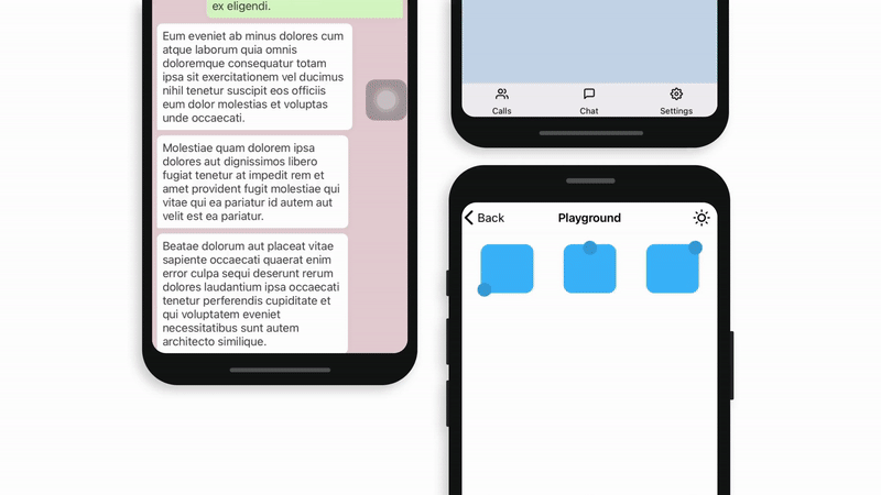
:::info If you want to see full examples in your phone or simulator, you can clone this showcase project and run 🔥 :::
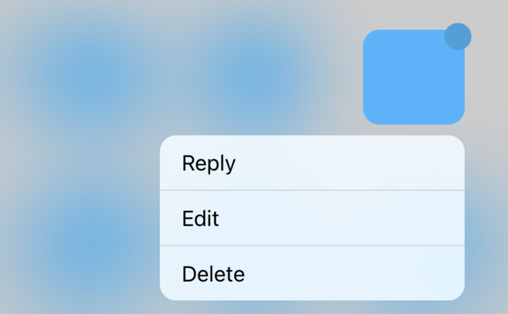
Configuring List
Sample List
Code
<HoldItem
  items={[
    { text: 'Reply', onPress: () => {} },
    { text: 'Edit', onPress: () => {} },
    { text: 'Delete', onPress: () => {} },
  ]}
/>
Result
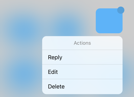
List with title
Code
<HoldItem
  items={[
    { text: 'Actions', isTitle: true, onPress: () => {} },
    { text: 'Reply', onPress: () => {} },
    { text: 'Edit', onPress: () => {} },
    { text: 'Delete', onPress: () => {} },
  ]}
/>
Result
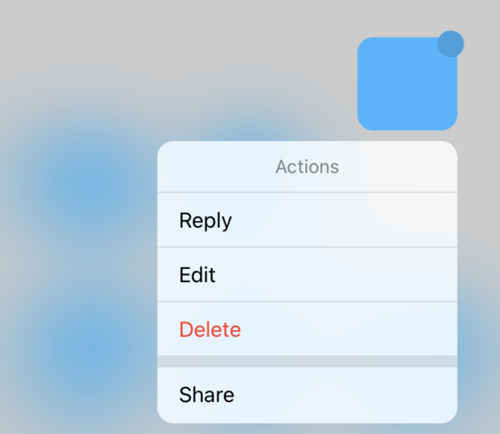
List with separator
Code
<HoldItem
  items={[
    { text: 'Actions', isTitle: true, onPress: () => {} },
    { text: 'Reply', onPress: () => {} },
    { text: 'Edit', onPress: () => {} },
    { text: 'Delete', withSeparator: true, onPress: () => {} },
    { text: 'Share', onPress: () => {} },
  ]}
/>
Result

List with destructive button
Code
<HoldItem
  items={[
    { text: 'Actions', isTitle: true, onPress: () => {} },
    { text: 'Reply', onPress: () => {} },
    { text: 'Edit', onPress: () => {} },
    {
      text: 'Delete',
      withSeparator: true,
      isDestructive: true,
      onPress: () => {},
    },
    { text: 'Share', onPress: () => {} },
  ]}
/>
Result
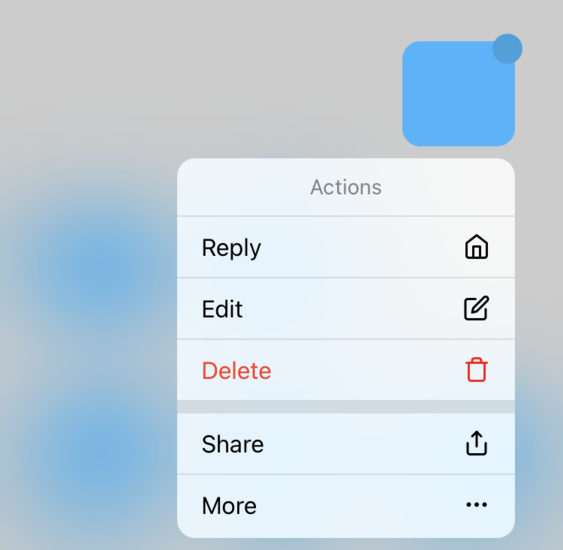
List with icons
Code
<HoldItem
  items={[
    { text: 'Action', isTitle: true, onPress: () => {} },
    {
      text: 'Home',
      icon: () => <Icon name="home" size={18} />,
      onPress: () => {},
    },
    {
      text: 'Edit',
      icon: () => <Icon name="edit" size={18} />,
      onPress: () => {},
    },
    {
      text: 'Delete',
      icon: () => <Icon name="delete" size={18} />,
      withSeparator: true,
      isDestructive: true,
      onPress: () => {},
    },
    {
      text: 'Share',
      icon: () => <Icon name="share" size={18} />,
      onPress: () => {},
    },
    {
      text: 'More',
      icon: () => <Icon name="more-horizontal" size={18} />,
      onPress: () => {},
    },
  ]}
/>
Result
Contributors
License
Show Your Support
Please give a star if you like this project! 🤩